Alright my love buggies.
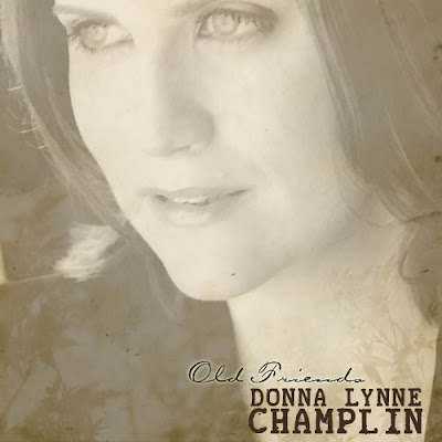
My AWESOME, BRILLIANT, GENEROUS, GENIUS friend Robbie Rozelle has been working with me tirelessly on narrowing down two possible options for the CD Cover.
While i think I might have a small preference for one over the other....
I'm really wanting to know what you all think.
Please tell me which one you think best encapsulates what your impression is of the CD so far (by reading the blog here)....
First one: Self explanatory
(I leeerrrrrvvv the very subtle autumn leaves Robbie put in there 'cause i described this album to him as having a kind of 'autumny' sound).
The SECOND option....
This is a picture of my grandmother when she was a baby, posing with her sister.
She's represented by a song on the album.
I'll hesitate saying anymore about this photo for fear of swaying you emotionally....
but i'll fill you in later.
So....what do you think?
We have the same eyes.
I've always loved this picture of her...
and I especially love how it's slightly worn and has some tears.
it looks....'loved' to me.
this picture.
Anyway-
Robbie and I are fascinated to hear your thoughts!!!
Please put a comment down....
or email me at dlc@donnalynnechamplin.com if you'd rather it be a private convo.
THANK YOU THANK YOU THANK YOU so much Robbie and everyone who chimes in!!!
xoxo
dl


Hi, just a fan. I prefer the second one, definitely. The first is a great picture of you and I like the leaf effect, but it is really generic as far as album covers go. The second one wants me to pick up the album, stroke my chin, and say "Why, I wonder what THIS is all about." I also really love the font and color of your name, it pops.
ReplyDeleteBoth covers are GORGEOUS but I'm really fond of the second one. It says alot about remembering where some of your influence as an artist comes from...in my personal opinion. It's also pretty original, lots of artists use their own picture as the cover of their first solo album.
ReplyDeleteI'll buy it either way! Haha.
Good luck choosing! :)
I'm LOVING this blog.
I have to agree with the previous two comments. The second has so much character.
ReplyDeleteI did it! I got to the CD covers! Yes, add my vote to the second one. The first one, though beautiful (and you are beautiful) is just like everyone else and you, my lady, are not like everyone else. BUT: I would like to see your lovely face somewhere else, maybe on the back or in the liner notes.. preferably on the back actually. It just makes sense to me for your mug to be there to greet them with "Hi, you who have never seen a Broadway show! I'm an awesome singer and I'm here to Balm your Gilead."
ReplyDeleteGut reaction: I am firmly in the #1 camp. Your picture, the design, the feel - I love it! I didn't have the emotional response to #2. Sorry grandma :-(
ReplyDeleteThe first one I thought - here is someone who is now, today's talent. I wanted to buy it! (I'm going to buy it no matter what cover is on it, FYI!) The second one I thought, eh, not so much...she's gonna rehash some old songs that we've heard every variation of...nothing new or contemporary.
Just my opinion...can't wait to see which one wins!
to me the CD cover needs to portray what the feel of the album is. I really do love both, but the second one- (while AWESOME) makes me think of an old bluegrass album. Something I might find on an Alison Krauss album. So while I think it is really cool looking, the 1st to me gives the impression of what I think your CD is gearing more towards based on your posts.
ReplyDeleteEh- Just my opinion... I'll buy it either way!
NO. 1 - much easier to market. If you are going for an album by a Broadway singer then this is what people expect in that market. If you are going for the 'singer/songwriter' vibe then go with NO. 2.
ReplyDeleteThose are my thoughts...